Illustration and Visual Narrative - Task 2 : Composition

12/10/2024- 1/11/2024 (week 4 - week 6)


Cindy Noverin / 0376409

Illustration and Visual Narrative / Bachelor of Design (Hons) in Creative Media / Taylors University

Task 2 : Composition


TABLE OF CONTENTS

Lectures

Instructions 

Further Reading


Lectures

Week 4 

IVN 02 - Chiaroscuro

Chiaroscuro that means light and dark in Italian, explains how the use of shading and lighting are important to make a character more dimensional. it could be used and manipulated to create different vibe and it is used a lot in painting, illustration, even in cinematic field and theatre. it could create tension, attract attention like using a spotlight on main character during theatre, create sensational effect, and composition. 

Week 5

Mr. hafiz gave us tutorial on how to apply gradient and colors using the gradient tool and color options

Week 6

Mr. Hafiz gave us lecture about how to extract colors from our character to make a reference board using the website called adobe color

back to top


Instructions


Task 2 Composition

Illustration progress
we were given the task to do backgrounds for our character from vormator challenge or we can make a new character. the requirement is to follow one of the composition in the framed ink book given by mr. hafiz as reference. before I started on making the sketch, I tried doing the background for my current character on my iPad using the procreate app. and after I finished the work, I put it in a Pokemon card maker website and here's the result


fig.2.1. Nogris basic Pokemon card (16/10/24)

Then, looking at how it turned out, I feel like its going to be less challenging if I did the basic version of nogris so I decided to do his evolution. I first search some pictures of cats and tigers anatomy and learn how to draw it. 
fig.2.2. sketches of nogris

Next, I got into making the reference board to compile what I 've done so far.

fig.2.3. reference board (25/10/24)

after that, I started to do the character on illustrator starting with Rhigris body, then the forest I overlayed the sketch on top of my drawings so I can see the position of the objects. for the trees i first make few branch and copy paste it, repositioned the layers and add colors. where the tree color goes darker as it goes deeper through the forest.

fig.2.4. Rhigris colored with backgrounds (29/10/24)

then i first focus on Rhigris gradient and i put some pattern that i used using the vormator shapes from task 1 : vormator challenge.

fig.2.5. Rhigris with gradient and pattern (29/10/24)

I continued on making the shadows and add more effect to the background and put the front tree in the front layer and give it some light to make it looks like the sunlight pass through the tree leaves.
I also put some fluff to his body to not make it look too round.

fig.2.6.1. Rhigris rendered (31/10/24)

fig.2.6.2. outlines (31/10/24)

I asked for feedback from people around me and i fix and did a little bit of touch up and finished the artwork.

fig.2.7. final artwork (1/11/24)

Pokemon card Progress
after doing the illustration, its time to put it into a pokemon card. this is the point where i realized that i need to make my artwork in landscape, while i hope that i could make it a full art card, i used the pokemon card maker again to try doing the full art card.
fig.2.8. Rhigris full art pokemon card maker (1/11/24)

looking at it again, I know its not going to work, because the ability description is not visible enough. because Rhigris is a fighter pokemon, i searched google for fighter type pokemon card template and paste it in photoshop. I exported the layers separately (the front cover, Rhigris, aand background) and distort it to adjust with the card. I also search what kind of typeface is used for pokemon card and it mostly says that it uses gill sans, so i used that font. 

So after all adjustment that I did, here's the final result of Rhigris pokemon card.
fig.2.9.Rhigris final Pokemon card with photoshop (1/11/24)
back to top

FINAL SUBMISSION


fig.2.10. Rhigris overview (1/11/24)

fig.2.11. Rhigris full art (1/11/2024)

fig.2.12. Rhigris pokemon card (1/11/24)

back to top


Feedback

Week 5

Mr. Hafiz said that my sketch is good overall, and suggest i make the reference board for him to observe easier and to include some inspiration for color and image references

back to top


Reflections

Making Rhigris is a fun experience because i get to explore the illustrator app more. During the making of the artwork, i just realize that RGB and CMYK color settings are very different and i feel limited when it comes to choice of colors. The hardest part of making the character is attaching the feet while maintaining the lines so it doesn't look weird. At the end, i need to create different layer for the lines and the color. adding the fluff for his body is also complicated, i plan on just leaving it just i outlines but at the end i fill the colors because it looks unfinished.

back to top


Further Reading / Sources

Case study of Tubik in Paris
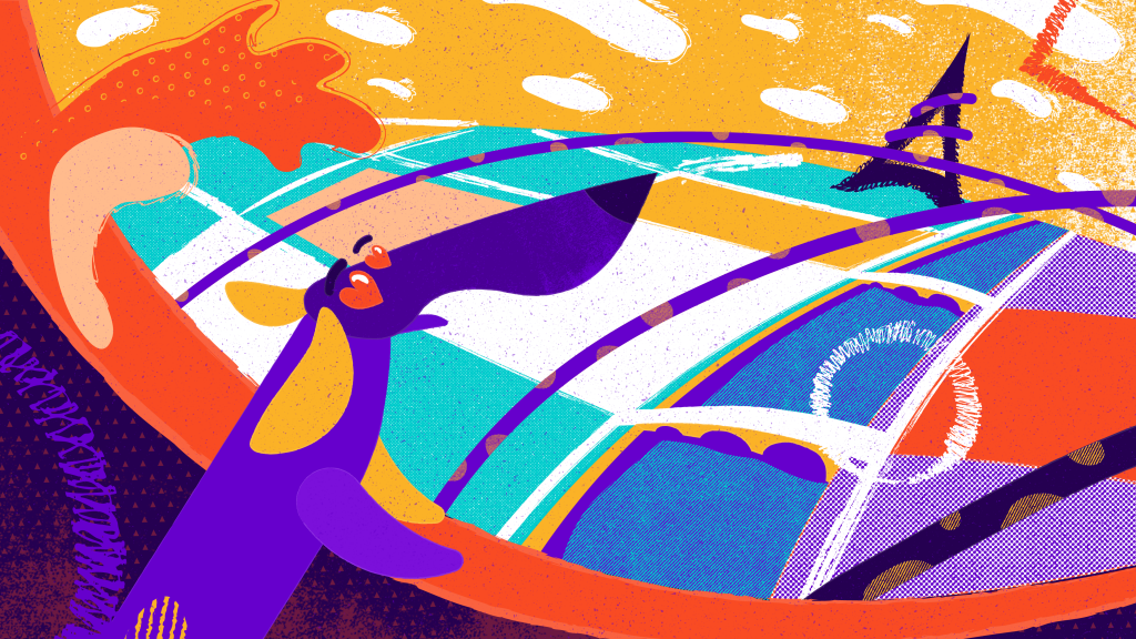
digital illustration case study

case study of Tubik in paris, article shows a the process in making illustration narrative where in this work, it shows a story of a dog roaming around in Paris. 

i first notice the colorful choice of colors and how it didn't clash with each other, the artist also used different texture and pattern to create shading and to make the color more textured. he created a lot of shapes to look like theres motion in the artwork that really could explains the story board

Source


Comments

Popular posts from this blog

Typography - Task 1 : Exercises

Design Principles - Task 3 : Development & Design

Design Principles - Task 1 : Exploration