Design Principles - Task 3 : Development & Design

03/03/2025- 19/03/2025 (week 5 - week 7)

Cindy Noverin / 0376409

Design Principles / Bachelor of Design (Hons) in Creative Media / Taylors University

Task 3 : Development and Design


TABLE OF CONTENTS

Instructions

Development and Design

Final Artwork

Feedback

Reflection

Further Readings


Instructions


Development & Design

1. Visual Reference
fig.1.1. hand reference (my friends group photo)

fig.1.2. Selected design, AidaIro's New Year of Dragon (2024) artwork


fig.1.3. AidaIro's this New Year of Snake (2025) artwork  

fig.1.4. AidaIro's New Year of Rabbit (2023) artwork


fig.1.5. S2E10 Toilet Bound Hanako-kun, Yashiro Nene


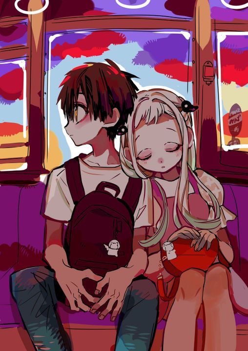
fig.1.6. Amane and Yashiro in a train by AidaIro


2. Sketch and Development

from three of the sketches I made, I Chose to develop the third sketch Where nene is improved because She is drawn as a Chibi body composition. and I start digitizing and develop my sketch using Procreate

fig.2.1. Chosen Sketch


Fig.2.2. improved sketch & line art progress

explanation for fig.2.2. 
I start doing the sketch on my iPad using procreate to improve my lineart, I added the clouds to make it a part of Japan traditional art, putting the bunny as replacement of the teal colored dragon in AdiaIro's artwork, and drew candies as the bunny called Mokke is a ghost that likes stealing things specifically candy.


fig.2.3. finished line art

explanation for fig.2.3.
then, I did the line art using a line art pen that I usually use on Procreate, making sure everything looks clean, I drew it in different layers so later on I can erase and the line art doesn't crash.  


after week 6 feedback I decided to start over with my sketch because I myself feel unsatisfied with the work and I moved to IbisPaint X to do my drawing


fig.2.4. sketch Progress


explanation for fig.2.4.
when re-doing the sketch, I struggle a lot on how to make it look less stiff so I redraw the character but leave the elements at that. I look for some poses in kimono in Pinterest for some reference but couldn't find the pose that I want so I tried doing a similar pose with hanako.


fig.2.5. Rendering Progress

explanation for fig.2.5.
when I started coloring, I tried to make the Kimono dress as similar as the one in AidaIro's artwork but I improvise the pattern. I added a lot of shading to give it more Volume and depth.

fig.2.6. continued rendering

explanation for fig.2.6.
I continued rendering the character because I still couldn't see how how emphasize the drawing because it somehow blend it with the back ground and if I chose a gradient back ground it will look ugly so I ask my friends and artclub friends for advice and one of them says to give it a white outer stroke so Nene could stand out more and it works. I continue with bolder shading to give it more contrast and other colors blending I chose in the picture above 


fig.2.7. finishing touch

explanation for fig.2.7.
FINALLY, for the finishing touch, I put back the elements I drew on my previous attempt and replace real horn and tails into something like a photo filter. I added hanako as the last element because the empty space on top of her dress could get some purpose. and for the end I added noise overlay and my signature.


fig.2.8. Timelapse

timelapseeeeeeeeeee of my artworkkkkk ^^^^^^^^^^^

FINAL ARTWORK 


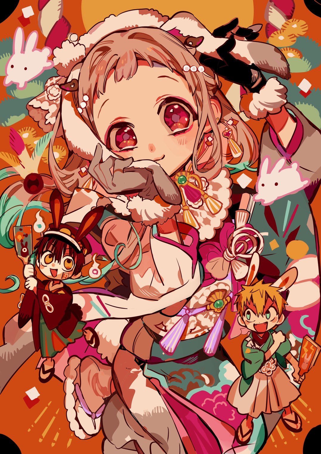
fig.3.1. final artwork

Title : Ryū no Hana 龍の花
Artist : Cindy Noverin
month/year : 03/2025
Medium : Digital Canvas 
Size : A4 (2480 x 3508 px, 300 dpi)
Time took : 44 hours and 37 minutes

Rationale : 

The reason I chose to do this drawing is to draw Nene Yashiro as She is Hanako's other half. The title "Ryū no Hana 龍の花" has the meaning "the dragon's flower". I chose this name because in AidaIro's artwork Dragon Hanako Shows Hanako as a dragon and based on my analysis a he is a dragon because he also have something to protect. In this sense, meaning Nene is Hanako's flower as she in the written Comic Series later on is fated to pass away, just like how flowers are meant to wilt by time, but Hanako's tried to change her fate and sacrifices a lot for her, and this give more meaning on Why Hanako's a dragon and how Nene is the Dragon's Flower.

a little bit of analysis of my work


fig.3.2. design principles in my artwork

explanation for fig.3.2. 
Contrast in design Principles means something that have a difference in between elements where as in my drawing, there is a Size contrast Between Nene Yashiro and Hanako where she is drawn bigger and detailed. there's also contrast in the coloring choice that will catch the audience attention

Harmony in design principle means something thats various but work well together like the elements and the various hues in my artwork as well as the other elements that connects with Nene Yashiro's Personality

Unity in design principles means some elements that has repetition and has connection between them. in my work, I Used a lot of Japanese traditional art as a part of the elements like the flower and scale pattern in the kimono, the cloud that's surrounding her, and red & white shinto papers.

fig.3.3. Composition in my artwork

explanation for fig.3.3. 
in this artwork, I chose golden ratio as a guide for composition in my canvas. I drew the elements following the spiral while maintaining a spotlight for my character. For Hanako's chibi character, I chose to position him on top of her yukata because when I told my friend what he saw first, he says the dress caught his attention first, therefore feeling where the rule of thirds line would be I chose to put Hanako there. 


fig.3.4. more design principles in my artwork

explanation for fig.3.4. 
In this artwork, also take advantage of the golden ratio by positioning the Mokke bunny along the lines while maintaining flow with other elements like the clouds and the candies. 

After that, I struggle on how to make the character more pop out because I cant make it stand our without using a darker background or using the color background without making it looks like its one with the background. then, I got a suggestion from my friends to make a white outline from her and it actually gives a huge emphasis on my drawing.


Feedback

Week 6
Specific Feedback : 
the character looks too stiff and there's no flow. better to make it more dynamic and make the character stand out more.
General Feedback : 
I need to understand how to take advantage of the a4 canvas
             

Week 7
General Feedback : overall my e-port and artwork is good and it got a big improvement so I can complete it with final Reflection and Compilation


back to top


Reflections

for this exercise, I explored a lot of things like the pose and ways of shading that really helps me improve on my drawing style. I also learned to be more open minded with critics from people because it actually helps me improve on my artwork.

back to top


Further Reading

(あいだいろ@23巻発売中! (@Aidairo2009) / X, 2024)
(あいだいろ@23巻発売中! On X: “✨✨ https://t.co/11WHKRJ54D” / X, n.d.)
(あいだいろ@23巻発売中! On X: “あけましておめでとうございます 今年も花子くんをよろしくお願いいたします https://t.co/LGFV6iD0a1” / X, n.d.)
(あいだいろ@23巻発売中! On X: “✨🐍🐍🐍🐍✨ https://t.co/HBVKJNQPIK” / X, n.d.)
AidaIro. (2021). AidaIro Illustrations: Toilet-bound Hanako-kun. Yen Press.
AidaIro. (2023). AidaIro Illustrations: Toilet-bound Hanako-kun 2. Yen Press.
    back to top


    Comments

    Popular posts from this blog

    Typography - Task 1 : Exercises

    Design Principles - Task 1 : Exploration