Lecture 1 - Elements and Principles of
design
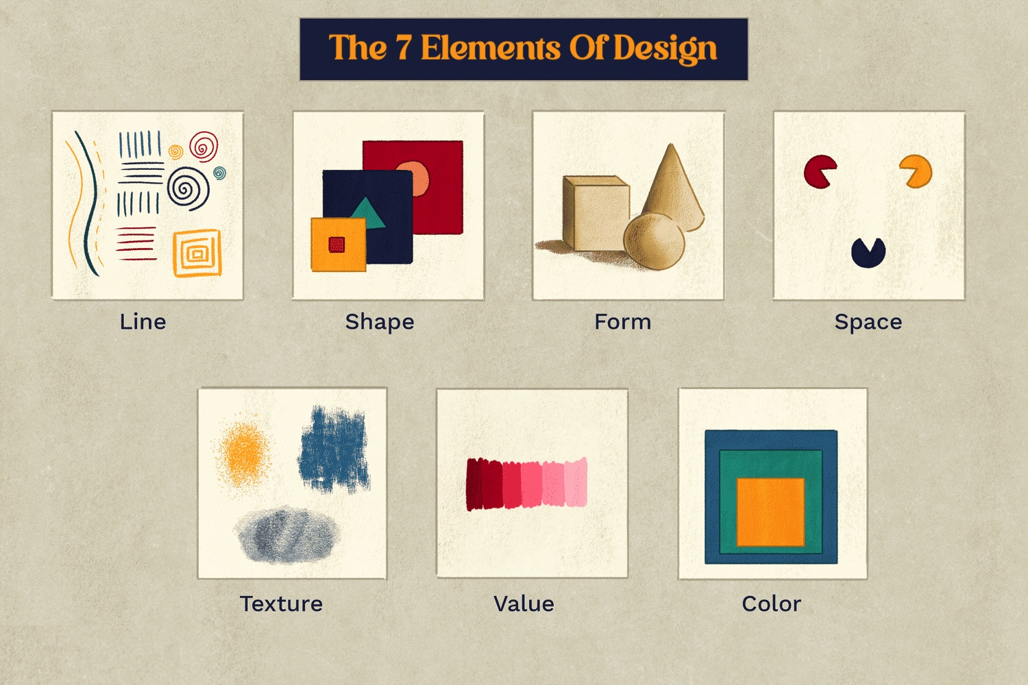
Elements of Design > are the individual
building blocks of creating a design
-
point = just a dot that used into repetition and
turns into line
-
line = various types of lines can indicate
shapes, spaces, imply volumes, suggest
motion and emotion, depend of what used on
the design
-
shape =
-
geometric = precise and regular
-
organic = irregular and relaxed
-
form = 3d area, when it enclose space, it gives
volume
-
texture = tactical qualities of
surfaces, divided into 2 which is (actual &
Simulated or implied)
-
space = positive - filled area, negative - empty
area
-
color =
-
hue = spectrum of colors, the pure hue
is in its highest saturation
-
value = lightness or darkness
-
pigment
-
tint = hue + white
-
tone = hue + grey
-
shade = hue + black
-
intensity = saturation or chroma
|
|
fig.1.1. seven elements of design
|
Lecture 2 - topic 1 : contrast and
Gestalt theory
Contrast is means a dissonance between
elements in one design artwork, there are many type
of contrast like, color contrast (huge difference of
color saturation between two elements ), shape
contrast (difference between shapes that are used in
a design artwork), size (difference between the size
of objects in a design artwork)
example of color contrast


|
|
fig.1.2. artwork by Ariel Sun
|
Applications for fig.1.2.
In this picture created by Ariel Sun, it shows a new
York style art of a women standing in front of a
wall with the light shining from the side. the color
she use for the light is orange and in contrast of
it, she uses a saturated dark blue for the shadow to
give it dimension and shapes.
example of shape contrast

|
|
fig.1.3. abstract portrait by KurArt
|
Applications for fig.1.3.
in this artwork made by Kur_Art that I found in
Pinterest, it shows an abstract work of a woman made
with geometrical shapes that consist a square and
circle. the contrast in this artwork is shown by the
shapes used and also the colorful pallete.
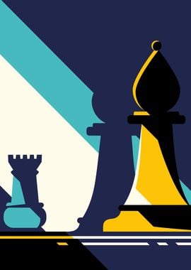
example of size contrast
|
fig.1.4. chess collection by KurArt
|
Applications for fig.1.4.
in this artwork also made by KurArt, it is shown
that theres a contrast between the size of the rook
and the bishop, this could be drawn by using
perspective where the bishop is taken from the front
and the rook Is in the back. in this artwork,
because the big size of the chess piece could
emphasize that the bishop side is winning against
the rook side.
Gestalt theory = is a theory that describes
how human eyes perceive visual elements and it aims
to show how complicated scenes an be turned to
simpler shapes/elements.
principle of similarity = shares that human
eyes tend to perceive similar elements even if the
elements are separated.

|
|
fig.1.5. pattern by KurArt
|
Applications for fig.1.5.
another work by KurArt, but in this artwork they
created a pattern for a merchandise product and in
this design work, it shows the principle of
similarity because there's repetition of objects and
I myself as a viewer will group the red planet
together as they are repeated to create a pattern.
principle of continuation = shares that human eye follows the path,
lines, and curves of a design and prefers to see
continuous flow.
Applications for fig.1.6.
this calendar made by Martyna shows the principle of
continuation. first thing that we would notice is
the picture and letter goose, that gives a flow
where it means we would have to read from the top to
the bottom. the next thing we'll see is the calendar
number that lies around the goose that 's also read
from top to bottom.
principle of closure = shares that human eye prefer to see
complete shapes, if its not complete, the user can
perceive the complete shapes by filling in the
visual information.

|
fig.1.7. red by Malika Favre
|
Applications for fig.1.7.
from this artwork called red by Malika Favre, we
could see a woman being one with the red back
ground. although it's pretty much red and black,
but we could see where her hair and that there's a
wall covering her as if she's peeking or hiding
behind the wall. this is because the principle of
closure makes us fill the missing lines.
principle of proximity = ensuring related design elements placed
together.

|
|
fig.1.8. Screen grab of Displate Website
|
Applications for fig.1.8.
from the screen grab that I took of a website
called Displate that sells Metal Poster of artwork
Created by Kur_Art, it shows the principle of
proximity where some category are put in the same
area. where the logo would be at the top, along
with the search bar and main icons that most
people would look for in an online shop, below the
search bar, shows some category of items of things
that people would mainly look for, like the
posters itself with other categories. out of the
website, principle of proximity is also
implemented in making software and desktop
interface where we can see from the screen grab I
took, the main settings of the software I use
would be placed in the top left of my screen, and
the laptop settings is put together on the top
right of my screen. for the safari it self group
the each tabs together in a line as well as the
apps that I'm using or shortcut at the bottom of
my screen.
principle of figure/ground = shares that object are instinctively
looks like its either in the foreground or
background. in my understanding, an example of
this principle is implemented in ambiguous image

|
|
fig.1.9. Dream Big by Yau Hoong Tang
|
Applications for fig.1.9.
in this illustration by Yau Hoong Tang that I
found in Behance, shows a picture of a bird and at
the same time, the wings of the birds became a
grassy cliff with a kid flying a paper airplane on
it. this artwork implement the principle of
figure/ground because the object in the picture is
drawn as a foreground and the background itslef
creates another illustrations. moreover, both of
the birds and paper airplane shares a same meaning
of freedom and dreams as it emphasize viewer to
dream big like the bird and the paper airplane
soaring in the sky.
law of symmetry and order = shares that elements that are
symmetrical to eachother tend to be perceived as a
unified group.

|
|
fig.1.10. Zebra 1988 HS by Victor Vasarely
|
Applications for fig.1.10.
in this artwork called "Zebra" by Victor Vasarely
shows a picture of two Zebra in a stripes
background. the position of stripes and curves
create dimensions and symmetry as they are also
aligned perfectly.
Lecture 3 - Topic 2 : Balance and
Emphasis
Balance is a distribution of visual weight
in a work of design.
-
symmetrical balance = got equal weight
on equal sides of the design, part of it theres,
radial balance where designers arrange elements
equally around central points.
-
asymmetrical balance = got unequal
weight on each side of composition
-
golden ratio = ratio from fibonacci
sequence thats used to guide designer create
design harmoniously and balanced.
-
rule of third = a composition guide line to create
more dynamism in an artwork.
Emphasis and dominance is what used to
draw attention to a specific part of the design.
this can also be called as focal point
Example of Asymmetrical Balance and Symmetrical
Balance
Applications for fig.1.11.
in this illustration created by Tiago shows Sacred
beings drawn in asymmetrical balance where the goat
like spiritual guardian is the center point and the
surroundings are drawn with various object but the
negative space are balanced even if they are
asymmetrical. even so, this picture also shows
symmetrical balance where the goat like guardian and
light on top of it are drawn in symmetry and had the
same pattern.
example of radial balance and emphasis

|
|
fig.1.12. Balloon by Malika Favre
|
Applications for fig.1.12.
in this artwork by Malika Favre called balloons,
implement radial balance as the grids of the air
balloon are arranged from one central point and from
the central point itself shows two person as the
central or focal points. as the big air balloon is
dominating the artwork and as it is surrounded by
space, it creates more emphasis or attention to the
air balloon and the two person in the artwork.
Lecture 4 - Topic 3 : Repetition and
Movement
Repetition is done by repeating elements or
shape to create a pattern and rhythm. using
repetition could make a work of design seem more
active
Movement is the way a design leads the eye
in/around and through a composition
example of Movement and Repetition

|
fig.1.13. Terrain Vague , 2018, Malika
Favre
|
Applications for fig.1.13.
this picture is made by Malika Favre in 2018 in
collaboration of a wine company. there are
repetition of lines that create a stripes pattern,
and the way that it's drawn in wave shows that
theres movement. moreover, this work of art is also
showing emphasis and contrast, where the contrast of
the red color of the house give us a focal point.
Hierarchy is a Choreography of content in
composition to communicate information and convey
meaning of the artwork
Alignments are the placements of
elements in a way that edges line up along common
rows/columns of their bodies along a common centre.

|
|
fig.1.14. Jaws movie Poster by Roger Kastel
|
Applications for fig.1.14.
in this Movie poster "JAWS" by Roger Kastel, it
shows hierarchy of the elements that need to be
viewed first, which is the title in big red text,
then followed by the picture of the shark. then
people would be able to see the starring actor on
the top of the poster, the co-star and company at
the bottom with smaller text. moreover, this poster
also uses alignment as everything is aligned to the
middle giving it a reading flow.
Lecture 5 - Topic 4 : Harmony and Unity
Harmony is the selection of elements that
shares a common trait work together visually
Unity is repetition of particular elements
throughout designs and ensures that all elements
feel connected, creating a cohesive design.

|
|
fig.1.15. Visions 2023 illustration book cover
by Mika Pikazo
|
Applications for fig.1.15.
in this artwork drawn by Mika Pikazo, an artist from
Japan, she drew a character using vibrant neon
colors while leaving the skin color neutral, it
creates emphasis as the character became the focal
point. the flowers that surrounding the character
face, her flowing hair, water, and geometric shapes
gives a sense of movement and as messy as it sounds,
she's able to balance them out with colors that
gives makes the artwork unite well. With her choice
of colors that have the same saturation but vibrant
hues gives the artwork harmony in the
compositions.
Scale refers to the size of an object in relation to other objects or
its surroundings. It helps show how big or small something appears
compared to something else.

|
|
fig.1.16. picture I took of Giant Pinocchio in
Italian Village, South Korea
|
Applications for fig.1.16.
This picture that I took of giant Pinocchio statue
in Italian Village , South Korea, is a great example
of scale where the statue is very big and tall that
when I took picture if it from the bottom it looks
like it's dominating the whole area that even the
large building next to it looks smaller.
proportion is size of an object's part in
relationship of other parts of the same object,
simply means the the size connection between parts
of an object that is put together

|
|
fig.1.17. the Weeping Woman, 1937 by Pablo
Picasso
|
Applications for fig.1.17.
in this artwork made by Pablo Picasso, Shows an
illustration of The Weeping woman, distorts
the proportion to emphasize emotion. Her head is larger, and her eyes and mouth are exaggerated, making her grief more intense. Instead of
realistic proportions, Picasso breaks the rules to create a chaotic, emotional impact to the
artwork.
Lecture 6 - Topic 5 : Symbol, Word and
Image
symbol is a sign, shape or objects thats used
to represent something
symbol can be specified into 2 types which is non
figurative and figurative, where figurative is
divided into two types which is visual and graphic,
and in graphic there is a pictorial, abstract and
arbitrary symbol

|
|
fig.1.18. Graphic Symbols
|
Applications for fig.1.18.
pictorial symbols resemble real-world objects and are easy to recognize. They are often
used in signs, icons, or logos. for example on the
picture shown a house that people would use
regularly in software to represents home page or the
main page of the software.
abstract symbols are
not fully resemble real objects but still have recognizable shapes. They are
often simplified or stylized versions of something.
like the logo of huawei and mitsubishi that people
would instantly recognise from the simple shapes and
strokes
while Arbitrary symbols do not visually represent what they mean; their meanings are learned through culture and
society. for example the jolly roger or what people
might have recognises as the pirate logo, because
they learned it.
Word and image is a vital part of design
because users and viewers are able to relate to a
concept or a brand if the right image and word are
used in a work of design
examples of symbols, word, and image

|
|
fig.1.19. "we can do it !" by J. Howard Miller
|
Applications for fig.1.19.
in this poster of probaganda during ww2, shows a
picture of Rosie the Riveter doing the pose of
getting to work and accompanied with the word "we
can do it!" symbolize female empowerment and
strength. although this is a probaganda to encourage
women during that era to participate in helping the
war, till this day it became an icon of feminisim
and power.
Selected Design/Artwork
|
|
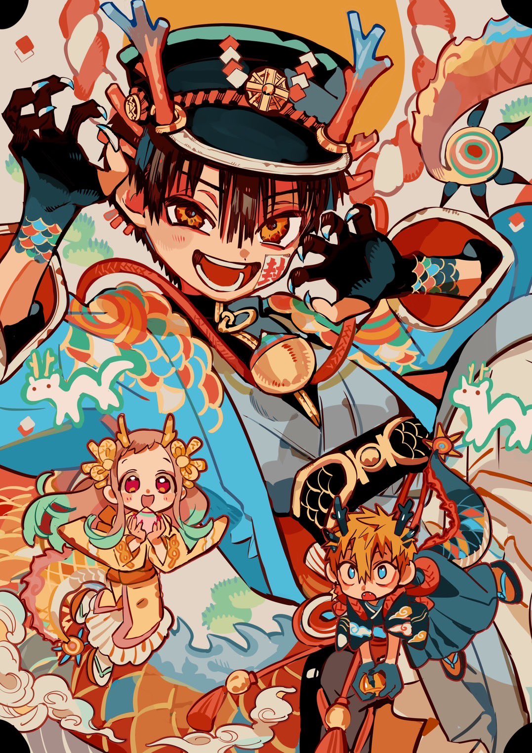
fig.2.1. Dragon Hanako by Aidairo
|
artist : Iro
year : 2024
medium : digital canvas
size : 1077 x 1523 pixels


Comments
Post a Comment