04/11/2024- 30/12/2024 (week 7- week 14)
Cindy Noverin / 0376409
Typography / Bachelor of Design (Hons) in Creative Media
/ Taylors University
Task 3 : Type design and communication
Lectures
Instructions
Feedback
Reflection
Further Reading
Lectures
Week 7
during this week face to face class, Mr. Vinod did a final
submission and feedback session for task 2 and start
instructing us in doing our task three. He instructed us
to write Hogb with the 3 pens that we brought and each pen
needs to have 3 writing styles.
Week 8 (Independent Learning Week)
we don't have face to face class during this week, but I
watch the pre-recorded lecture about making letters using
shape tool and stroke tool.
Week 9
we had a feedback session of the fonts that we did during
week 8. Mr Vinod gives us a short tutorial on how to use
the shape tool and confirm that we need to make all of our
fonts based on the letter "o"
Week 10
we had a feedback session where we submit our font
progress to the facebook group, then Mr. Vinod talks about
the progress of making punctuation that's posted on teams.
Week 11
we had to post our progress on the facebook group, and Mr.
Vinod helps other students adjusting their font and we can
start putting our fonts on Fontlab7
Week 12
we posted our progress on the facebook group. Mr. Vinods
walk around to help other students with the fonts side
bearings, where mine is good to go so I can start on
making the poster.
Week 13
we had to post our poster in the facebook group, Mr. Vinod
observes other student poster and help us finalize it also
to brief about our final submission and compilation that
could be done at the same day so that I don't have to come
to the next class
Instructions
Week 7
on this week, Mr. Vinod informed us to bring 3 type of markers that has
different tips. After concluding task 2, He said that we could start doing
our task 3 where we write the letter "H, o, g, b" using the pen that we
brought and each pen we need to at least write 3 styles of how the pen
can be used. I followed the instruction given especially the part where Mr.
Vinod said to not draw but actually write. so it has come to this kind of
result.
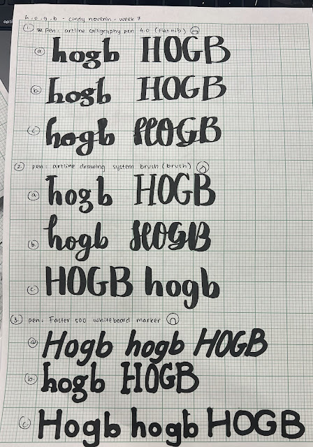 |
| fig.2.1. Hogb with different pentip (04/11/24) |
after this exercise, we also got some other instruction which is to do a
observation on one of the 10 fonts given by the lecturer. The Typeface that
I Chose to study is Bodoni Std Book which i found very simple but
complicated at the same time. theres one letter that are so easy to figure
out the shapes while the other letters are very hard to figure out
 |
| fig.2.2. Hogb deconstruction (06/11/24) |
 |
| fig.2.3. Hogb deconstruction separated (06/11/24) |
while doing the H and o, i found it quite easy since its just line and
circles. but when I start to crate shapes for the g letter, its so
complicated because the bowl for the o and the top of the g is different
so I have to do them again plus the other parts of the g. looking at it i
feel like i've done something wrong because how could there be so much
circles.
same goes for the letter b. the bowl is also different so i have to redo
it and i could conclude that every bowl of each letters that has one could
be different. even for the letter "b" the lines are slightly thinner than
the ascender. I could say that every letters are made with great details
and i think just a little bit of change would make it into a whole another
typeface.
 |
| fig.2.4. hogb deconstruction progress (09/11/24) |
Week 8 (Independent learning Week)
Because it is the independent learning week, Mr. Vinod gave us the
assignments 1 week in advance. For this week, we need to choose a writing
style that we like out of the 9 writing style that we did the week before.
Out of all of the writing style I decided to choose the number 2.c
Artline drawing system brush, the third style. the reason I choose
this is because I feel like it's more simple than the other writing
style.
I start on writing them in the same style but with other letters which is
(o l e d s n c h t i g , . ! # ). i wrote them in lower case and
uppercase.
 |
| fig.2.5. choosen writing style extended (13/11/24) |
after finishing this I get straight to watch the lecture tutorial that
explain shapes and stroke & brush. I did some experimenting. First
with the stroke and brush method, then the shapes. doing them gives me
better vision on how I want my font going to be displayed. although using
the stroke would be better because I used a brush pen, i think it would be
cool to have a font thats based on brush pen but its not too messy.
 |
| fig.2.6. glyphoid construction progress (14/11/24) |
 |
| fig.2.7. glyphoid construction outline (14/11/24) |
 |
| fig.2.8. glyphoid final type construction before feedback (17/11/24) |
Week 9-11
 |
| fig.2.9. glyphoid progress board week 9- Week 12 (09/12/24) |
we had a long week of adjusting our fonts, adding punctuation, and
transfering our font in the font lab
I added more letters so the lowercase alphabet are complete and therefore I
wont have complications making the poster because I won't have any letters
limit.
FINAL RESULT
 |
| fig.3.1. glyphoid regular screengrab on Fontlab (16/12/24) |
 |
| fig.3.2. final type construction - Glyphoid regular - JPEG (16/12/24) |
fig.3.3. final type construction - Glyphoid regular - PDF (16/12/24)
Measurements
cap height : 734pt
ascender : 696pt
x-height : 500 pt
descender : -230 pt
 |
| fig.3.4. A4 BW poster white - JPEG (17/12/24) |
 |
| fig.3.5. A4 BW poster black - JPEG (17/12/24) |
fig.3.6. A4 black and white poster - PDF (17/12/24)
TEST MY FONT HERE
you can type the letters "a-z" and "." "," "#" "!"
DOWNLOAD THE FONT HERE
Week 7
specific feedback : during this week lecture, mr. Vinod ask us to submit our final task 2 and finalize it. for my task 2 text format, mr. Vinod doesn’t have any comment anymore. so i continued on starting task 3
general feedback : mr. Vinod highlights the submission for our e-portfolio and how some simple things like access to file, not documenting progress well can affect our grades
Week 8 (Independent Learning Week)
Specific Feedback : -
General Feedback : -
Week 9
Specific Feedback :
Mr. Vinod said that my font is consistent but not that consistent
because some letters got thinner stoke than o, s needs to be smaller at
top bigger at the bottom
General feedback :
this week we have a feedback session, t should under ascender height,
the end of one stroke needs to be on each opposite side, not to make the
line too wide because it leaves a lot of counter space
Week 10
Specific feedback :
he says that my font could be more round because the one I made is
flat
General feedback :
we have a feedback session, he says that we need to pay attention to
the puntuation and the size that we need to use for them
Week 11
Specific feedback :
Mr. Vinod said that my hashtag could be bigger and it should be the
size of the cap height.
General feedback :
we had a feedback session and Mr. Vinod help other students to fix
their typeface. we also need to put our letters to the fontlab
Week 12
specific feedback : Mr. Vinod said that my letter kerning is good and I can start on making the poster
general feedback : we had a feedback session and mr. Vinod helps other student adjusting their fonts kerning and sidebearing
back to top
Reflections
Experience
I had a fun time coming up with ways to make my letters, although there's some part of errors, i'm happy that I managed to make a font which is what I used to want to try and I actually get to. I also get to learn how to use fontlab, and learned some rules when making letters
Observations
when making this font, I noticed how I missed the slightest details when designing a typeface, like when mr. Vinod said that my letter "s" top curve should be smaller than the bottom, and how putting a curve on my letters could make it look better.
Findings
I find that making a font require a lot of patience and reflection as I need to look at it and export and download my fonts a couple of time to adjust them right to put it into my poster and finish it once and for all.
back to top
Further Reading
Kerning: Fitting Letters Together
Kerning is all about adjusting the space between letters to make text look balanced and readable. The book explains how certain letter pairs, like “AV” or “To,” naturally create awkward gaps if you don’t adjust them.
after I read this part, I really tried to adjust the side bearings as efficient as possible, while paying attention to the side bearing rules provided by mr. vinod
back to top


Comments
Post a Comment