Advanced Typography - Task 1 : Exercises
22/04/2025 - 14/04/2025 (Week 1 - Week 4)
Cindy Noverin / 0376409
Advanced Typography / Bachelor of Design in Creative Media / Taylors University
Task 1 : Exercise 1
TABLE OF CONTENTS
LECTURES
AdTypo_1_Typographic Systems
explains that all design is based on a structural system and according to
Elam 2007 there are eight major variations of structural system which is
:
- axial = elements are organized to the left or right of a single axis
- radial = all elements are extended from a point of focus
- dilation = all elements expand from a central point in a circular fashion
- random = elements appear to have no specific pattern or relationship
- grid = system of vertical and horizontal divisions
- transitional = informal system of layer banding (its on top and bottom of eachother but doesnt have to be the heading first)
- modular = a series of non objective elements that are constructed in as a standardised units
- bilateral = all text is arranged symmetrically on a single axis
AdvTypo_2_Typographic Composition
typographic composition
Design Principles Applied to Type
- Common design principles like emphasis, symmetry, alignment, and repetition are used.
- Some (e.g. emphasis and symmetry) translate well to type layout.
- Others (e.g. perspective, repetition) are harder to apply directly
- Rule of Third = not often used in typography but may help with placement of important content in a layout.
Typographic Systems (8 total)
- The Grid System (or Raster System) is the most used. It comes from letterpress printing and was developed further by Swiss Modernists (e.g., Josef Müller-Brockmann).
- It's modular, versatile, and easy to read—ideal for structured layouts.
Postmodern Typographic Systems
- Rebelled against order with chaos, randomness, and asymmetry.
- These designs still considered structure and intuition—they just presented it differently.
Environmental Grid System
- Based on real-world structures (buildings, interiors, etc.).
- Designers extract lines and curves from these environments and use them as a base for layouts.
- This system adds context, identity, and visual uniqueness to designs.
- It’s a reductionist and intuitive approach to layout, unique to the subject or organization.
AdvTypo_3_Context&Creativity
Handwriting is crucial in the study of typography as it influenced the
design of the first mechanically produced letter forms
Early type aimed to imitate handwriting, establishing standards for
form, spacing, and conventions.
Historical Context of Handwriting- The evolution of the Latin alphabet dates back to 1750 BCE, originating from proto-Sinaitic letter forms and hieroglyphics.
- The Phoenician alphabet marked a significant shift from pictorial representation to sound-based writing, influencing Greek and Latin alphabets.
- Cuneiform, used around 3400 BCE, was one of the earliest writing systems, characterized by wedge-shaped forms pressed into clay.
- Egyptian hieroglyphics combined ideograms and phonetic characters, contributing to the development of alphabetic systems.
- The influence of Egyptian writing on Greek and other scripts is often overlooked in Western narratives.
- The Greek alphabet evolved from the Phoenician system, introducing vowels and developing unique reading rhythms.
- Roman letters, influenced by Greek inscriptions, became more rounded and humanistic over time, leading to the development of lowercase Roman type.
- Under Charlemagne, the Carolingian minuscule standardized writing conventions, including spacing and punctuation, during a period of cultural stagnation in Europe.
- This reform laid the groundwork for modern European scripts.
- Movable type was pioneered in China and Korea, with significant advancements occurring in the late 14th century.
- The introduction of Hangul in Korea allowed for phonetic representation, contrasting with the complex character systems of Chinese writing.
- The Indus Valley Civilization (IVC) script, dating back to 3500-2000 BCE, remains undeciphered but is believed to have influenced later scripts.
- The Brahmi script, developed around 450-350 BCE, is foundational for many modern Indian scripts and influenced Southeast Asian writing systems.
- Indian scripts, particularly the Pallava script, significantly influenced writing systems across Southeast Asia.
- the Kawi script, indigenous to Java, served as a medium for communication among ancient kingdoms.
- There is a growing recognition of the importance of indigenous scripts and the need to digitize and preserve them.
- The rise of local programmers and designers is facilitating the creation of multi-script typefaces that incorporate vernacular languages.
AdTypo_4_Designing Type
there are two reasons for designing typefaces, by designer Sega Dupreeh,
Which is :
- Social Responsibility: Type design has a moral obligation to
improve legibility and fulfill specific needs.
- Artistic Expression: Designers have an intrinsic desire to
express themselves through their work.
Social Responsibility in Type Design
- Designers must recognize and address needs or problems in typography.
- The importance of clarity in the purpose of a typeface is emphasized,
as it guides the design process.
Notable Type Designers
- Adrian Frutiger: Known for the Frutiger typeface, designed for the
Charles de Gaulle Airport in 1968. The typeface aimed for high
legibility in various conditions, including poor lighting.
- Matthew Carter: Created Verdana for Microsoft, focusing on legibility
on screens, especially at small sizes. He also designed Bell Centennial,
which addressed printing challenges in telephone directories.
- Edward Johnston: Designed the Johnston Sans typeface for the London
Underground, aiming to unify various signage and create a modern yet
traditional look.
Design Process and Considerations
- The design process involves research, sketching, digitization,
testing, and deployment.
- Understanding type history, anatomy, and conventions is crucial for
effective type design.
- Sketching can be done traditionally or digitally, each with its pros
and cons.
Testing and Prototyping
- Rigorous testing is essential to refine and correct typefaces before
deployment.
- Feedback from stakeholders is vital to ensure the typeface meets its
intended purpose.
Construction of Typefaces
- Roman capitals are constructed using grids and circles, which help in
creating letter forms.
- Visual corrections, such as ink traps and spacing adjustments, are
necessary for legibility.
INSTRUCTIONS
For this exercise, we are assigned to explore 8 systems which
are Axial, Radial, Dilatational, Random, Grid, Modular, Transitional
and Bilateral in InDesign using the content given in the MIB. We were
also instructed to watch the InDesign demonstration videos in the
lecture playlist.
- Size 200 x 200 mm
- Colours: Black and additional colour
- Minor graphical elements
the template
"The Design School,
Taylor’s University
All Ripped Up: Punk Influences on Design
Open Public Lectures:
June 24, 2021
Lew Pik Svonn, 9AM-10AM
Ezrena Mohd., 10AM-11AM
Suzy Sulaiman, 11AM-12PM
June 25, 2021
Lim Whay Yin, 9AM-10AM
Fahmi Reza, 10AM-11AM
Manish Acharia, 11AM-12PM
Lecture Theatre 12"
My attempt on axial
I tried to check past students reference and books that are provided
by Mr. Vinod, I first arranged the content on my first attempt, then
rotated it. I was thinking to give it a little contrast by putting
the black area on the left side, but after the feedback session, Mr.
Vinod said that the black is very distracting and unnecessary so I
changed into dashed outline.

|
| fig.2.1.1. Axial Progress, Week 2 (29/04/25) |
ITC New Baskerville Std (Bold, Roman)
My attempt on bilateral
while looking at some reference provided, I arranged it with center
alignment and put it a little bit to the left side so I could put
the elements, like the circle, at first I feel like the circle is
too overwhelming so I toned it down a little by lowering its
opacity. after the feedback session, turns out I dont need the
circle at all so I removed it and rearranged it.

|
| fig.2.1.2. Bilateral Progress, Week 2 (29/04/25) |
fonts used
Futura std (heavy, Book)
till this moment, I'm still not sure how the modular words, I
thought I got it at first by arranging it per square, but it still
doesn't look like a modular system so I redo the position and I
ended up with the final result.
My attempt on Random System

|
| fig.2.1.3. Modular Progress, Week 2 (29/04/25) |
fonts used :
Futura std (heavy, heavy oblique, Book)
at first I was thinking to use the unused dilatational title into
the random and complete it with other unaligned words and elements
from other system aswell, but it still looks organized so I redo the
whole thing
first I make a random scribble path and put the option type on path,
then I put the other information randomly and with different colour
and group it to duplicate it as a group multiple times and play with
the opacity.
My attempt on Grid System
out of all the system i'd say that the grid system is the easiest. I just position them in lines that I created and put a little of elements. but when it was feedback session, Mr. Vinod said that the information of the time and lecturer is a little bit unclear so I fixed that and put some finishing touches.
My attempt on Dilatational system
 |
| fig.2.1.4. Random Progress, Week 2 (29/04/25) |
Fonts used
Futura std (heavy, heavy oblique, Book)
ITC New Baskerville Std (Bold, Roman)
Bembo (bold)
out of all the system i'd say that the grid system is the easiest. I just position them in lines that I created and put a little of elements. but when it was feedback session, Mr. Vinod said that the information of the time and lecturer is a little bit unclear so I fixed that and put some finishing touches.

|
| fig.2.1.5. Grid Progress, Week 2 (29/04/25) |
fonts used :
Futura std (Bold, Medium, Book)
this system is one that I take so much effort on, I first thought of
repeating the tittle but I cancel the idea because it looks messier
than I thought, I also thought of making the dilatational shaped
form a shape of a electric guitar but scrapped the idea because it
will make the information looks complicated and all over the
place.
I decided to start all over again with creating multiple circle to
put the text on, arranged it so the information is easy to read and
added elements of the multiple lines. If you look at it again, it
would somehow look like a punk hair. :D
My attempt on Transitional System

|
| fig.2.1.6. Dilatational Progress, Week 2 (29/04/25) |
fonts used :
ITC New Baskerville Std (Bold, Roman)
My attempt on Transitional System
I first try to do something interesting with the title, by creating
outlines for it and connecting the letter, cause punk have a
correlation with rock or metal music, I thought of stretching the n
to make it look like a thunder, although people cannot see It that
much. after creating them, I added the "all ripped up :" and other
information and arranged it to follow the flow of the decorated
title and thats it.
My attempt on Radial System

|
| fig.2.1.7. Transational Progress, Week 2 (29/04/25) |
fonts used :
Univers lt std (roman, bold)
radial system is the most troublesome for me, I wonder why Indesign
wouldn't create a shortcut to arrange the text radially, through out
the process, all I do is just selecting and rotating the text,
trying my best that the rotation point is perfectly in the middle of
the circle so that it doesn't look off, I also don't know whats the
best way to arrange them so I just put it wherever I want and for
the time and lecturer name, I decided to arrange it like a thunder
too but it didn't look that visible.
Final Result before Feedback

|
| fig.2.1.8. Radial Progress, Week 2 (29/04/25) |
fonts used :
Futura std (Bold, Book)
Final Result before Feedback

|
| fig.2.1.9. Final 8 System before Feedback, Week 2 (30/04/25) |
Final Result after Feedback

|
|
fig.2.1.10. Final 8 System after feedback, Week 2
(30/04/25) |
Exercise 1 Final Result

|
| fig.2.1.11. Axial typography system, Week 2 (30/04/25) |

|
|
fig.2.1.12. Radial typography system, Week 2 (30/04/25)
|

|
| fig.2.1.13. Transitional typography system, Week 2 (30/04/25) |

|
| fig.2.1.14. dilatational typography system, Week 2 (30/04/25) |

|
| fig.2.1.15. Grid typography system, Week 2 (30/04/25) |

|
| fig.2.1.16. bilateral typography system, Week 2 (30/04/25) |

|
| fig.2.1.17. modular typography system, Week 2 (30/04/25) |

|
| fig.2.1.18. random typography system, Week 2 (30/04/25) |
fig.2.1.19. all compiled 8 system without grid - PDF , Week 2
(30/04/25)
fig.2.1.20. all compiled 8 system with grid - PDF , Week 2
(30/04/25)
---
Exercise 2 : Type & Play: Finding Type
Research

|
| Fig.2.2.2. Research pictures in Pinterest, Week 3 (05/05/2025) |

|
| fig.2.2.3. Research Pictures, Week 3 (05/05/2025) |
I tried to look for lots of picture that has pattern or repetition
in it. I was thinking to do fries but I feel like it would be too
basic, then I thought of using light that reflects of a stained
windows, then stuck with using albalone shell or some other language
says its paua shell.

|
| fig.2.2.4.Image choosen, Week 3 (05/05/2025) |

|
|
fig.2.2.5. letter extraction, Week 3 (05/05/2025) |

|
|
fig.2.2.6. refining letter part 1, Week 3 (05/05/2025) |
when first drew the letters that I found in procreate then
extracted it in illustrator. I then smoothen the path and start to
find the reference font that I could use to form the letters. I
ended up using Futura Std Bold as my reference font.

|
|
fig.2.2.7. refining letter part 2,Week 3 (05/05/2025) |

|
|
fig.2.2.8. refining letter final before feedback, Week 3
(05/05/2025) |

|
| fig.2.2.9. Refining letters after feedback, Week 3 (07/05/2025) |
Final typeface

|
| fig.2.2.10. final letters result , Week 3 (07/05/2025) |
Poster making Process
I jumped through 2 app just to adjust to which that I could use to
make poster and I ended up using illustrator. I was thinking to make
the poster based on the word that I could form like "oh paus"
or "paua" but I felt like it wouldn't work so I searched again for a
picture of the shell itself, because there's rarely any hd pictures
of albalone shell, It really took me a long time to find the
paua/albalone shell.

|
| fig.2.2.11. first poster idea , Week 3 (07/05/2025) |

|
| fig.2.2.12. paua shell reference , Week 3 (07/05/2025) |
then I finally found one thats decent and not much going on around
it so i can edit it however i want. I came up with the idea of the
shell just alone in a white background. so I look up something
similar to what my vision is and start replicating it

|
| fig.2.2.13. Image reference , Week 3 (07/05/2025) |
I didn't document much of the progress but I did lots of googling on a better movie poster layout and I ended up with this one, I added shadow, then a faint reflection by duplicating it and adding another shape of it, making it the same color as the background, and adjusted the opacity. to make it less plain, I added noise filter for texture

|
| fig.2.2.14. poster result 1, Week 3 (10/05/2025) |
after the last class feedback where I used the gradient as the final
typeface, Mr. Vinod Recommend me to put the gradient later on in the
poster so for finishing touch, I worked on the gradient for the
poster

|
| fig.2.2.15. Final Poster Result , Week 4 (13/05/2025) |
when its feedback session, Mr. Vinod is quite confused on what the picture is but he said I did good with the overall mock up poster and I could end the work here.
Exercise 2 - Final Result

|
| fig.2.2.16. Image and Extraction, Week 4 (18/05/2025) |

|
|
fig.2.2.17. Refining Letters Process, Week 4 (18/05/2025) |

|
|
fig.2.2.18. Extracted letterforms w/baseline, Week 4
(18/05/2025) |

|
| fig.2.2.19. Reference Font , Futura Std Bold , Week 4 (18/05/2025) |

|
| fig.2.2.20. Final Letterform , Week 4 (18/05/2025) |

|
| fig.2.2.21. original extraction(top) & final letterforms(bottom) comparison, Week 4 (18/05/2025) |
fig.2.2.22. Exercise 2 Part 1 compilation - PDF, Week 4 (18/05/2025)

|
| fig.2.2.23. Final Movie Poster - JPEG, Week 4 (18/05/2025) |
fig.2.2.24. Final Movie Poster-PDF , Week 4 (18/05/25)
FEEDBACK
Week 1
General Feedback :
Mr. Vinod brief us about the module and the upcoming
task that we'll be expecting, we also got a short
explanations about the Typographic System Definition and
His
Week 2
General Feedback :
we had a feedback session for our 8 typograpic system
and explanation about our week 2 assignments
Specific feedback :
the black half is not great contrast for axial, the
the transational is okay, the grid is good but the
information is a little bit unclear because of the
bold. the radial is good, the dilatational is the best
he had seen, the modular cannot be said as modular,
and the circle in bilateral is distracting.
Week 3
General Feedback :
we had a feedback session, where he said mostly is that
there need to be consistentcy and characteristics of the
objects
Specific Feedback :
Mr. Vinod said that overal shapes is good but
inconsistent. i either need to wave it more or smoothen it
more, i also could make more lines inside of the letters
instead of the gradient
Week 4
general feedback :
when creating a layout we set the margins, information
below us not a decoration and its supposed to be
readable
Specific Feedback :
good job
REFLECTION
Experience
my experience during the first 4 weeks of typography is
overwhelming for me. especially when theres 4 other module
I'm taking this semester. I underestimated the assignments
and wasted a lot of time procrastinating. Even so, It's
quite fun learning about the typographic system, making
letters, and making mock up posters
Observation
when listening to feedbacks, I realize that I sometimes
forgot the slightest details needed in making a work
works. I also realize that elements in typographic designs
are supposed to be used to lead viewer to the content
instead of distracting the viewer to look at the elements
instead
Findings
I found that there could be a lot of things that can be
turned into a typeface. and the process of making a
typeface itself requires a lot of research and revising.
so does doing the 8 typographic system where I really need
to understand it to be able to implement it.
FURTHER READING
Typographic System by Kimberly Elam

from this book by Kimberly Elam about typographic system, I got a lot of inspiration and reference from it, especially for the first few attempts to make the typographic system for Axial, Radial, and Dilatational.
Kreatif Beats by Vinod Nair

Nair, V. (2023, December 13). Finding Type: A novel typographic exercise. +. https://kreatifbeats.com/2023/08/06/finding-type-a-novel-typographic-exercise/

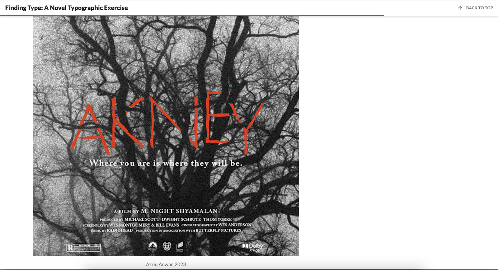
I used the website provided by Mr. Vinod to guide me through my typeface refining process, and took a lot of reference from the pictures that are provided there, like the typeface thats made from tree branches and the butterfly poster with "bread" as it's title


Comments
Post a Comment