INSTRUCTIONS
Module Information Booklet
Week 1 - Exercise 1
 |
| fig.1. Exercise 1 Instructions |
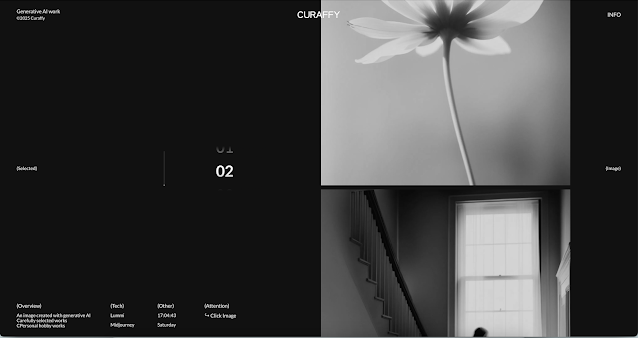 |
| fig.1.2. Curaffy by Tomoya Okada (25/04/25) |
Introduction :
Curaffy is a Website made by Tomoya Okada showcasing specifically AI works that he likes. Tomoya Okada has gotten 9 nomines and 7 award being the site of the day in CSS Winner. His design is mostly made with black and white as the base color and uses sans sherif typeface in most of his website
Analysis :
Visual =
in this website titled CURAFFY, my first impression of it is it looks cinematic because it's a gallery and we can scroll to each picture selected as if we are rolling film tapes. the design is simple and the layout is very tidy. when you scroll through it, you can click on the picture and it will brings us to another page that shows the colored picture which makes it looks more alive because it is monochrome before. the AI work used is also very high quality and nice to see.
Functionality =
for the functionality, I feel like there's nothing much to explore or even found. the only option is to click the image, go back to the gallery and scroll. the first time I open this website, I struggle to navigate because the buttons are hard to find as it is blended in with the descriptions of the pictures.
Performance =
the performance of this website is very smooth and very responsive on my laptop and my phone, although the layout one the phone is more plain and gives less movement while on my laptop, there's like a water drop effect following my cursor.
 |
| fig.1.3. Visual Bussiness by Vederico Valla (25/04/25) |
Introduction :
this website called "VISUALBUSSINESS" is a commission made by Vederico Valla from Italy. he is a creative director that has made a lot off eye catching website since 2022 and this website is one of his recent work.
Analysis :
Visual =
my first impression impression if this website is that it caught my eye with the layout of the elements also the positioning and numbering. it looks very randomize d and tidy at the same time. although it uses monochrome for the graphic design it still managed to deliver a message that its a Photo studio and Modeling Business. when I clicked at the picture, I noticed that each picture has a story and it makes it feels like i'm scrolling to an webcomic especially with the panel positioning
Functionality =
For the functionality, it's pretty straightforward. You can scroll, click into the portfolios, and view more detailed projects. you could click on mostly anything. Navigation is simple but not super interactive — it’s more about looking and appreciating the visuals. I noticed the menu is small and a little hidden at first, so it took me a second to realize I could open it. after exploring for a few minutes, it’s easy to move around, but there’s not a lot of extra features or surprises.
Performance =
The performance is very good on both my laptop and my phone. It loads fast and the transitions are smooth, which makes the experience feel premium. On my laptop, the full-screen layouts look especially sharp and cinematic. On my phone, it’s still good, but the experience feels a bit more compact and you lose some of that big, gallery-like feeling.
 |
| fig.1.4. martian labs portfolio website (25/04/25) |
Introduction :
This website made by Martian Labs themselves showcases their graphic design business. they had gotten a lot of commission from various companies even some that we might know now. their graphic design skill is also what we can call a professional. to know that they made this website themselves wouldn't even sound surprising anymore.
Analysis :
Visual =
my first impression of this website is that its crazy, it immediately felt bold and futuristic. The design is clean and minimalistic, yet it has a strong personality with its space-themed visuals. they used large typography and is very consistent with the choice of colors and the "Don't hire us" pop up is very funny. the layout is very simple and easy to read and navigate
Functionality =
The website is serving its purpose and I get to know who Martian is and why I shouldn't hire them. Navigating the site is straightforward. The menu is accessible, and each section flows as you scroll. The "Don't Hire Martian" section adds a humor to the website, giving the visitors a unique impression of this company. However, I don't really understand the function of the switch button to be used for making contact or seeing their work because it made me expect that the switch is going to be moving too
Performance =
The website performs well on my phone. On desktop, the animations and transitions are too much, like there's so much happening that my laptop started to lag the moment I scroll to a certain part that has a lot of motion. On mobile, the site remains responsive, though some of visual especially the rows are only one, making it feel slightly less dynamic compared to the desktop version.
 |
| fig.1.5. grafika design main web and portfolio (26/04/25) |
Introduction :
Grafika design is a website made by Grafika Design themselves where they promote their services in doing Web design.
Analysis :
Visual:
When I first opened the Grafika Designs Awards page, my first impression is that its a very simple website that showcases their portfolio. The layout is clean and straightforward, with a focus on showcasing their numerous achievement. The use of logos from various award organizations adds credibility and visual interest. It gives off a sense of prestige and accomplishment, making it clear that this agency is recognized in the industry. the choice of colors used is also a perfect fit even though the shade of blue in this color palette looks cheap, they complement it with orange that gives it contrast and emphasize it to give visitor impression that it's a trusted Design Company.
Functionality:
Navigating the page is simple. The awards are categorized by organization, and each section lists the number and type of awards received. There's not much animation so it's not that overwhelming to see, therefore the straightforward presentation makes it easy to proccess the information.
Performance:
The page loads quickly and is responsive on both my laptop and phone. The minimalist design ensures that there's no lag or performance issues. On mobile, the layout adjusts well, maintaining readability and its easy to navigate
 |
| fig.1.6. studio mona logo flash page (26/04/25) |
 |
| fig.1.7. studio mona experience page (26/04/25) |
Introduction :
this website is called "Studio Mona" thats a French design studio offering ready-to-adopt logos for creators and entrepreneurs. and all of the designs are made by Sophie DKF.
Analysis :
Visual =
When I first opened the Studio Mona "Logos Flashs" page, it felt very elegant and calming. The layout is clean and minimalistic, where it showcases the logo designs made by Sophie. Each logo is presented with its own unique name and style, although it's a different type of logos, she manages to blend it together by using the same type of frame for the showcase. The use of soft colors and delicate typography adds to the overall aesthetic appearance
Functionality:
Navigating the page is straightforward. Each logo is clickable, leading to a detailed page with more information about the design, its intended use, and customization options. The descriptions are clear, and the process for adopting a logo is well-explained. the simple animations for the website is perfect fit for the portfolio because it makes it look elegant.
Performance:
The website performs well on both my laptop and phone. It loads quickly, and the responsive design ensures that the layout adjusts appropriately to different screen sizes. On mobile, the site maintains its clean look, but it lacks some dynamic effect than how my laptop would show, so it makes it feel less engaging compared to other modern websites.
REFLECTION
from this exercises, I learned to do a great analysis on websites and It has helped me in implementing thm when replicating and making new websites in the future. moreover, the second exercise has helped me get familiar with making websites layout and how each element would be displayed.


Comments
Post a Comment