Advanced Typography - Task 2 : Key Artwork & Collateral
20/05/2025 - 11/06/2025 (Week 5 - Week 8)
Cindy Noverin / 0376409
Advanced Typography / Bachelor of Design in Creative Media / Taylors University
Task 2
TABLE OF CONTENTS
- Task 2A progress
- Task 2A final result
- Task 2B progress
- Task 2B final result
- Task 2A & 2B Compilation
LECTURES
AdTypo_5_PerceptionAndOrganization
Perception is the way
in which something is regarded, understood, or interpreted. Perception
in typography deals with the visual navigation and interpretation of
the reader via contrast, form, and organisation of the content.
Content can be textual, visual, graphical or in the form of
color.
Contrast

|
| figure 1.1. Methods of Contrast by Rudi Ruegg |
There are several methods of making contrast, the image above are methods of contrasts devised by Rufi Ruegg, but Carl Dair on the other hand, adds 2 more principles which are texture and direction. Thus, there are 7 methods:
- Size

|
| figure 1.2. Applications of Contrast by Size |
The contrast of size provides a point to which the reader's attention is drawn, e.g; small and big letter, we will see big letters first then the small letter, thus people usually make the title or heading in a bigger point size than the body text.
- Weight

|
| figure 1.3. Application of Contrast by Weight |
Weight describes the bold type that can stand put in the middle of the lighter type of the same style. The heavy is the powerful point of visual attraction or emphasis, thus not only types can have varying weight.
- Form

|
|
figure 1.4. Application of Contrast by Form |
The form is the distinction between a capital letter and its lowercase
equivalent, or a roman letter and its italic variant, condensed and
expanded versions of the typeface are also included under the contrast
of form. Thus, form is basically the typeface variants.
- Structure
|
| figure 1.5. Application of Contrast by Structure |
- Texture

|
| figure 1.6. Application of Contrast by Texture |
Texture (putting together contrast, size, weight, form, and structure) is the way a type look as a whole up close and from a distance, it depends partly on the letterforms themselves and partly on how they're arranged.
- Direction

|
|
figure 1.7. Application of Contrast by Direction |
Direction is the opposition between vertical and horizontal, and the
angles in between them. This method can be achieved by turning one
word to its side (dramatic effect), mixing wide blocks of long lines
with tall columns of a short line, etc.
- Color

|
| figure 1.8. Application of Contrast by Color |
The use of color is suggested that a second color is often less emphatic in value than plain black on white. Therefore it is important to which element needs to be emphasized and pay attention to the tonal values of the colors that are used.
Images: Carl Dair's 7 Typographical Contrast
Form


figure 1.9. Use of Form
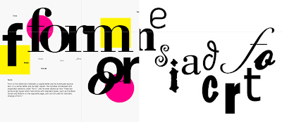
Form refers to the overall look and feel of the elements that make up the typographic composition, it plays a role in visual impact and first impressions. A good form tends to be visually intriguing to the eye which means it leads the eye from point to point, entertaining the mind and is most often memorable. Form originates from the Greek word "typos" (form) and "graphics" (writing), typography means to write in accordance with the form and have 2 functions:
Form provides a sense of letterforms' unique characteristics and
abstract presentation.

The interplay of meaning and form brings a balanced harmony both in terms of function and expression. When a typeface is perceived as a form, it no longer reads a letter because it has been manipulated (distortion, texture, enlargement, and extrusion).

Organisation - Gestalt
Gestalt physchology is an attempt to understand the laws behind the ability a=to acquire and maintain meaningful perceptions. The gestalt theory emphasizes that the whole of anything is greater than its parts.
Gestalt: Perceptual Organisation / Grouping
1. Law of Similarity
This law stated that all elements that are similar to each other tend to be perceived as a unified group. Similarity refers to any number of features including color, orientation, size, or intended motion.
2. Law of proximity
Law of Proximity states, elements that are close together tend to be perceived as a unified group meaning that item that is close to each other tend to be grouped together, whereas item further are less likely to be grouped together.
3. Law of Closure


Refers to the mind's tendency to see complete figures or form even if a picture is incomplete, partially hidden, or part of the information needed is missing.
4. Law of Continuation
Human tends to perceive each of 2 or more objects as different, singular, and uninterrupted object even when they intersect. The alignment of the objects/forms plays a major role in this principle.
5. Law of Symmetry (Praganz)
States that elements that are symmetrical to each other tend to be perceived as a unified group. Similar to the law of similarity, this rule suggests that objects that are symmetrical with each other will be more likely to be grouped together than objects not symmetrical with each other.
figure 1.10. Combination of Letters and Numbers Using Form
The interplay of meaning and form brings a balanced harmony both in terms of function and expression. When a typeface is perceived as a form, it no longer reads a letter because it has been manipulated (distortion, texture, enlargement, and extrusion).
figure 1.11. Manipulated Typeface in Form
Organisation - Gestalt
Gestalt physchology is an attempt to understand the laws behind the ability a=to acquire and maintain meaningful perceptions. The gestalt theory emphasizes that the whole of anything is greater than its parts.
Gestalt: Perceptual Organisation / Grouping

|
| figure 1.12. Gestalt Principle of Grouping |
1. Law of Similarity

|
| figure 1.13. Law of Similarity |
This law stated that all elements that are similar to each other tend to be perceived as a unified group. Similarity refers to any number of features including color, orientation, size, or intended motion.
2. Law of proximity

|
| figure 1.14 Law of Proximity |
Law of Proximity states, elements that are close together tend to be perceived as a unified group meaning that item that is close to each other tend to be grouped together, whereas item further are less likely to be grouped together.
3. Law of Closure
figure 1.15. Law of Closure
Refers to the mind's tendency to see complete figures or form even if a picture is incomplete, partially hidden, or part of the information needed is missing.
4. Law of Continuation

|
| figure 1.16. Law of Continuation |
Human tends to perceive each of 2 or more objects as different, singular, and uninterrupted object even when they intersect. The alignment of the objects/forms plays a major role in this principle.
5. Law of Symmetry (Praganz)

|
| figure 1.17. Law of Symmetry |
States that elements that are symmetrical to each other tend to be perceived as a unified group. Similar to the law of similarity, this rule suggests that objects that are symmetrical with each other will be more likely to be grouped together than objects not symmetrical with each other.
INSTRUCTIONS
Task 2A :
In task 2A, we were given instructions to create a wordmark of our
own name/pseudonym.
Submission:
- Black wordmark on white background
- White wordmark on black background
- Colour palette
-
Wordmark in actual colours on lightest shade of
colour palette
- Wordmark in lightest shade of colour palette on darkest shade of colour palette
- wordmark animation
Task 2B :
Using the wordmark that we created from task 2A, we were instructed
to expand the visual identity and apply its idea/ design to chosen
collaterals. This also included creating a layout design for my own
Instagram page.
What we need to submit:
- Collateral 1, 2, 3
- Instagram link
- IG screen grab with good resolution
TASK 2A :

|
| fig.2.1.1. Mindmap, Week 4 (17/05/2025) |
my first idea for my word mark is to use my artist name "hafuri" for it
because I really like my artist name. it has a combination of my family
name 林 in Chinese but if it turns into a Japanese word it's says
"hayashi" then I have a Character named "fuwari" that I
used as my artist name and "riri" is a nickname in games that I
used a lot so it already has stuck with me.
I started developing it with some sketch, and I didn't look at much of
reference or heavily referencing any idea so I just started sketching
with my pen and brush in my sketch book

|
| fig.2.1.2.sketch, Week 4 (17/05/2025) |

|
| fig.2.1.3.digitization, Week 5 (19/05/2025) |
then I started digitizing the work with a couple concept and word mark
that could have a correlation with my personality and preference. I
stopped and finalize the bubbly hafuri wordmark and submit it in our
first feedback session.
after feedback week 5
since the idea of hafuri is using a Japanese vibes name, it is very far
from my origin because I'm a Chinese Indonesian. Mr. Vinod Suggest that
I should dig into my origin a little more, where honestly I can't find
an interest in my own home country (Dumai, Riau) because I don't really
participate or implement the Culture there like Melayu Riau (even though
I learnt it at school) because I'm Chinese, so what I do in my family is
mostly Chinese tradition. However, I don't feel like I want to be known
as by my Chinese name because I feel like it's something that I only
want to share for my family and friends.
while thinking of what I could do for a new word mark I kept scribbling
on my sketchbook with my real name instead and finally came up with
this.

|
| fig.2.1.4. sketch, Week 5 (20/05/2025) |
I took a picture of it right away and started to digitize it.

|
| fig.2.1.5. digitization process, Week 5 (24/05/2025) |
I invert it to see if there is some uneven curves and tried to kinda a
way to make it balanced, so I pull down the "overin" lower to the middle
and pull the end of the "n" to make the beginning higher and the end
lower so it looks balanced on both sides, I adjusted the width of each
lines and tried to make it more even.

|
| fig.2.1.6. final before feedback, Week 6 (26/05/2025) |
after feedback session, the only thing that mr. Vinod Comments about is
the slightly untidy alignment of the letters and I just need to fix
that. He also mentioned that the color palette should be more lighter
and not dull to create a more strong impression for viewers.

|
| fig.2.1.7. color exploration, Week 6 (28/05/2025) |

|
| fig.2.1.8. color application, Week 6 (29/05/2025) |

|
| fig.2.1.9. final after feedback, Week 6 (29/05/2025) |

|
| fig.2.1.10. animation progress, Week 7 (07/06/2025) |

|
| fig.2.1.11. animation final, Week 7 (07/06/2025) |
TASK 2A FINAL OUTCOME

|
| fig.2.1.12. black wordmark on white background, Week 6 (29/05/2025) |

|
| fig.2.1.13. white wordmark on black background, Week 6 (29/05/2025) |

|
| fig.2.1.14. color palette, Week 6 (29/05/2025) |

|
| fig.2.1.15. actual color wordmark on lightest shade background, Week 6 (29/05/2025) |

|
| fig.2.1.16. lightest shade wordmark on darkest color background, Week 6 (29/05/2025) |
|
|
|
fig.2.1.17. Key Artwork Animation, Week
7 (07/06/2025) |
fig.2.1.18. PDF, Week 6 (29/05/2025)
TASK 2B :
first I chose to do a shorter version of my word mark, turned it
into a some kind of hidden letterform logo? to make it a pattern.
I extracted the N and r from the word mark and rotate the r
and cropped it into the n, it look into closely, it could spell out
the letters "n, o, v, e, r, I" and the same n to complete my
wordmark name. I turned it into a pattern from Canva but turns out
it looks very inconsistent.

|
| fig.2.2.1. shorter wordmark logo progress, Week 6 (30/05/2025) |

|
| fig.2.2.2. shorter wordmark final, Week 7 (05/06/2025) |

|
| fig.2.2.3. pattern progress, Week 7 (05/06/2025) |

|
|
fig.2.2.4. pattern final, Week 7 (05/06/2025)
|
after finishing the pattern, I started on editing a picture of
myself into the brand, I used a picture I took in semester one, that
I'd think i'll use as my eternal profile picture of my main account
and business stuff. I removed the background and played with my
color palette, outer stroke, and blending mode.

|
| fig.2.2.5. poster progress, Week 6 (30/05/2025) |

|
| fig.2.2.6. poster result , Week 6 (30/05/2025) |
after all of that, I tried to find all the mockup the free website
could have, I have considered a lot of items to used as a mock up
but I ended up with the metal cup, tote bag and rubber bracelet. I
might have taken a liking to the black shirt and pattern that I made
but I feel like I couldn't choose it cause I couldn't change the
shirt color to my color palette so I got back to the three option
that I chose.

|
|
fig.2.2.7. mockup products search, Week 6 (30/05/2025) |

|
| fig.2.2.8. mockup products editing, Week 6 (30/05/2025) |

|
| fig.2.2.9. mock up result before feedback (03/06/2025) |

|
| fig.2.2.10. final mock up, Week 7 (04/06/2025) |

|
|
fig.2.2.11. final, Week 8 (11/06/2025) |
TASK 2B FINAL OUTCOME

|
| fig.2.2.12. collateral 1, Week 8 (11/06/2025) |

|
| fig.2.2.13. collateral 2, Week 8 (11/06/2025) |

|
| fig.2.2.14. collateral 3, Week 8 (11/06/2025) |

|
| fig.2.2.15. instagram feed design layout, Week 8 (11/06/2025) |
instagram link : https://www.instagram.com/noverin.design?igsh=ZW41ZDJiMndxYjJ3

|
|
fig.2.2.16. screenshot of instagram page, Week 8 (11/06/2025) |
fig.2.2.17. Task 2B Final Compilation - PDF , Week
8 (11/06/2025)
TASK 2 FINAL COMPILATION
2A
|
|
| fig.2.3. black wordmark on white background, Week 6 (29/05/2025) |
|
|
| fig.2.4. white wordmark on black background, Week 6 (29/05/2025) |
|
|
| fig.2.5. color palette, Week 6 (29/05/2025) |
|
|
| fig.2.6. actual color wordmark on lightest shade background, Week 6 (29/05/2025) |
|
|
| fig.2.7. lightest shade wordmark on darkest color background, Week 6 (29/05/2025) |
|
|
|
fig.2.8. Key Artwork Animation, Week
7 (07/06/2025) |
fig.2.9. PDF, Week 6 (29/05/2025)
2B
|
|
| fig.2.10. collateral 1, Week 8 (11/06/2025) |
|
|
| fig.2.11. collateral 2, Week 8 (11/06/2025) |
|
|
| fig.2.12. collateral 3, Week 8 (11/06/2025) |
|
|
| fig.2.13. instagram feed design layout, Week 8 (11/06/2025) |
instagram link : https://www.instagram.com/noverin.design?igsh=ZW41ZDJiMndxYjJ3
|
|
|
fig.2.14. screenshot of instagram page, Week 8 (11/06/2025) |
FEEDBACK
Week 5
General feedback :
we don’t need to think about the color palette just yet. also not to put
anything that will make people ambigous of , especially obvious objects
Specific feedback :
I need to dig into my origin a little more?
Week 6:
General Feedback :
pay attention to alignment, and path by zooming in and out, its
imporstant to pay attention to the construction
Specific Feedback :
i need to fix the wordmark so it aligns better in a line, abstract
& script is not the fitting keyword, colors option need to be 1,
dark shade, 2light shade and 2 middle shate thats complementary and
contrasting
Week 7 :
General Feedback :
we had a feedback session where we show our collateral wordmark result
Specific Feedback :
i could make the mock up backgrounds based on my color palette
Week 8 :
General Feedback :-
Specific Feedback :
the pattern is good but there's a little bit inconsistent, expansion
needs a lot more to go and theres lots of room for improvement, the
animation is good
REFLECTION
EXPERIENCE
when doing these task I experience a lot of dilemma on what kind of self
branding I should and would do for myself, I almost cried because of
this because I was so lost on how I could do it, I scribble and feel
like none of this is what I like. but at the same time I don't know what
I like. after finishing this task I felt a little proud of myself
because it looks decent enough that I like it, and I enjoy doing the
task 2b more than doing the task 2a.
OBSERVATION
Throughout the process, I observed that I tend to be highly critical of
my own work, especially when it involves personal expression. I also
noticed that I work better when I stop trying to force a “perfect”
result and instead allow the design to evolve naturally. The more rigid
the task, the more pressure I felt — whereas when I had more space to
explore visually or emotionally, I was more engaged. I also noticed that
I gravitate toward softer aesthetics and balanced, minimal compositions,
even if I don’t always recognize that at first.
FINDINGS
I found that one of the biggest challenges in this task was not the
design itself, but figuring out what actually feels right for me. I kept
changing directions because nothing seemed to represent me properly, and
that made the process emotionally draining. Still, once I let go of the
pressure to get it “right,” things started to make more sense. Task 2B,
in particular, felt more enjoyable because it gave me more space to
experiment and think in my own way. From this, I realized that I don’t
fully know what I like yet — and that’s fine. This task didn’t give me
all the answers, but it helped me get a bit closer to understanding my
own style and preferences.
FURTHER READING

|
| fig.5.1. San Antonio Book Festival |
from this website, I Saw how they managed to make a brand and wordmark
based on the city in Texas with the colorful color palette thats also
based on the color of the umbrella, and the variety of colors makes the
brand look festive and colorful.

|
|
fig.5.2. Paula Scher : Atlantic Theatre Company |
from this website showcasing Paula Scher work for Atlantic Theatre
company shows how the expression of the brand is strong and consistent,
they used the long trapezoid as part of their brand but also making it
looks like a spotlight and graphical elements for the posters. With
redesigning new brand for the theatre company, it'll make the visual
personality matches the bold approach to theatre


Comments
Post a Comment