Digital Photography and Imaging - Week 1

23/09/2024-week 1
Cindy Noverin / 0376409
Digital Photography and Imaging / Bachelor of Design ( Hons )in Creative Media / Taylors University
Task 1 : Exercise 1
2. Introduction to Google Drive folder system.
3. Introduction to Collage
4. Prepare collage's design elements for Week 2 exercise.
5. Past students collage works: https://fauziyusoff.com/dpicollage
on the first week we were given task to browse our Pinterest account and look up some design composition that we like or found interesting. here are some of my favorites designs and the reason why. From the research that I've found, there are a few Design Graphic Composition. Among all of them here's the 3 design composition that's my favorite

|
| fig.1.1. |

|
| fig.1.2. |

|
|
fig.1.3. |
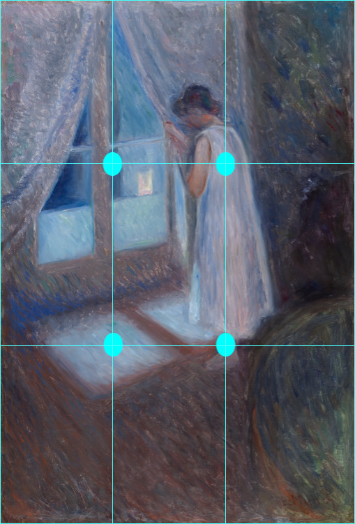
The first one is the rule of third.
the reason why I chose rule of third is how everything will go well when using this kind of composition. it can also be implemented in photographing. where you put your objects in its always between the the middle row of the rule of third frame. the reason of this composition is that people tend to look at certain spot of the artwork and when you put your objects in the place that they see the most, it will make your work stand out more.
|
|
|
fig.1.2. (The Girl by the Window, Edvard Munch, 1893) |
The second one is triangle or pyramid.
I often see this kind of design or drawing compositions in a lot of artist's artwork. from some art or digital drawings studies that I have watch in the past, like one on YouTube titled "How to learn Composition". It tells us about how design composition like shapes are an another part of drawing or making an artwork. Some popular artist often uses this method to make their art stands out. Putting their objects within these three points of triangle will make viewers pays attention to them, so artist would put the part where they want to stand out the most in a shape of a triangle. For example from this portrait below, you could see that the woman in the portrait are sitting with two of her kids making triangular shape, with her head on the first point, her toes on the second and the last point is the kid bending over while playing with the other kid. Without the triangle outlines you could notice the objects fast and paid attention to what's going on in the drawings.
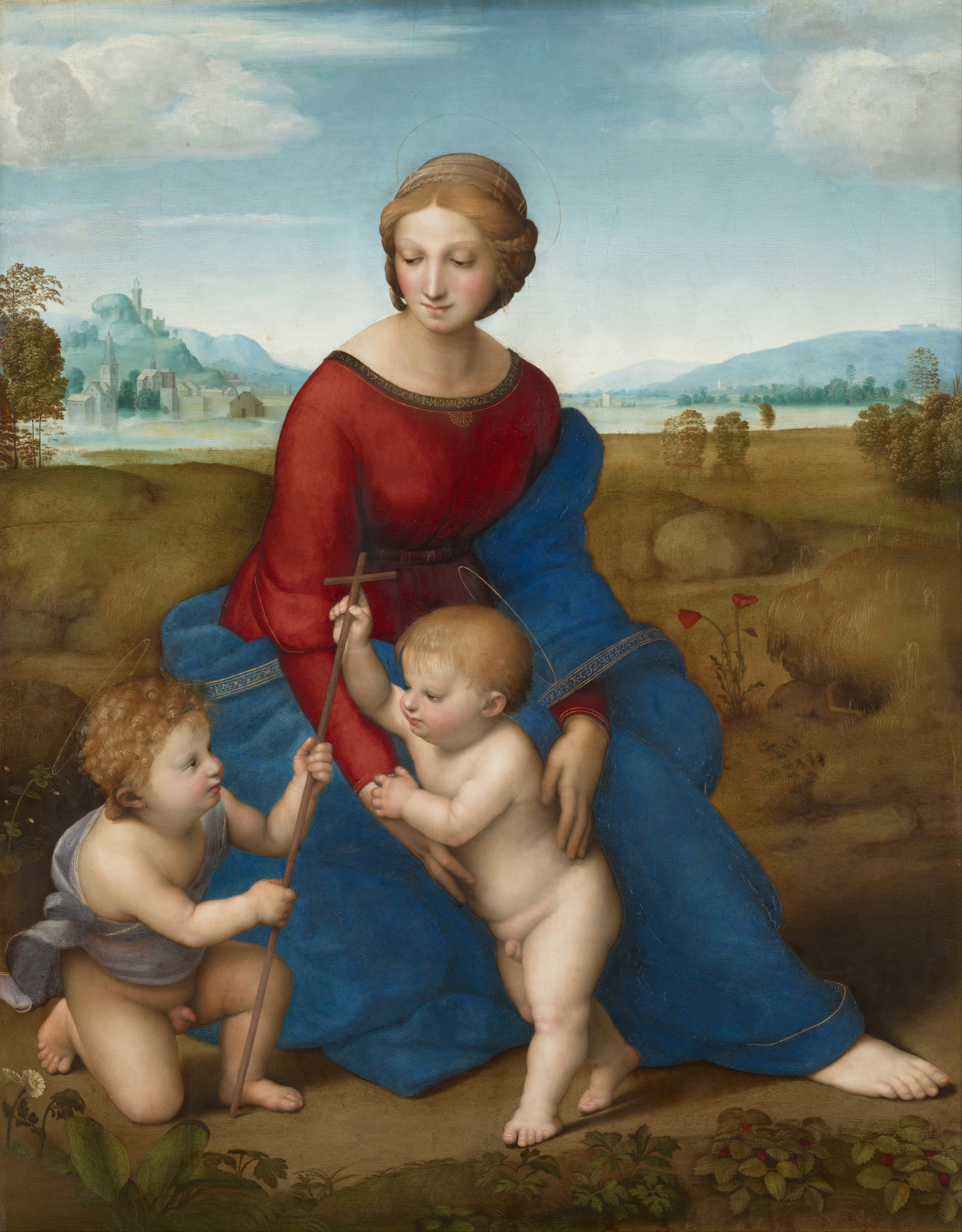 |
fig.1.3. (Madonna in the Meadow, Raphael, 1505-1506) |
the third one is focal point.
Also, this is the type of design composition that I see a lot when it comes to designing or making an artwork. To make viewers focus on the object, the designer or artist often uses this composition to make it stand out. there are many ways to form a focal points. It could be by just making the object surrounded by other objects or maybe the objects doing or having something that stands out from the other objects. Like this drawings by Forain of a Tight rope walker in the middle of a crowded space. not only that, the color of her dress contrast to what the other people are wearing so it makes her stands out even more.
 |
fig.1.1. 4. (Tight-Rope Walker, Forain) |


Comments
Post a Comment