Typography - Task 2: Typographic Exploration and Communication
21/10/2024- 05/11/2024 (week 5- week 7)
Cindy Noverin / 0376409 Typography / Bachelor of Design (Hons) in Creative Media / Taylors UniversityTask 2 - Typographic Exploration and Communication
Lecture Typo_5_Understanding
- Some uppercase could appear symmetrical but turns out it’s not due to illusions made.
- When making curves strokes for a lowercase letterforms, it needs to exceed the x-height so it will appear the same size as the vertical and horizontal stroke they adjoin
- When making letterforms we also need to consider the spaces because it would affect the readability
- Counterform= the spaces that are left in each letter
- Contrast = the different weight and width that usually used for bridges and stems. Mostly used to specify the important information
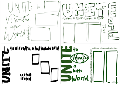
1. Sketches

|
| fig.2.1. text layout sketches (26/10/24) |
2. Headline

|
|
fig.2.2. type expression attempt (27/10/24) |
while doing the type expression, at first I didn't think of making something thats too extreme because when doing the word Unite, I have a dilemma on the readability. I tried using different typeface in one word and I guess it turn out quite well but I can't help but misread it and I'm also not sure if different typeface in one type expression is allowed, so I changed it into one typeface which is Bodoni Std. but I uses different font on it. I put the italic type for the I because if the N is Italic, combined together would make it look like M.
3. Layout

|
| fig.2.4. second layout attempt (27/10/24) |

|
| fig.2.5.third layout attempt (27/10/24) |
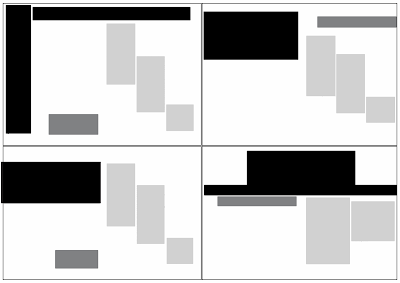
they both look somewhat familiar with the text position and the headline, the difference is that the second one got black backgrounds and different position of subtext.

|
| fig.2.6.fourth layout attempt (27/10/24) |
for the last one I got I tried to make the headline centered and did some letterspacing on the text there. if you don't notice I also make a parentheses on the Visualize word and World.

|
|
fig. 2.7. all text layout. (27/10/24) |

|
|
fig.2.8. all text layout blocked (27/10/24)
|
HEAD LINE
Typeface: Bodoni Std
Font/s: Bodoni Std Book, poster, Bold italic, book italic, Roman
Type Size/s:280 pt
Leading: - pt
Paragraph spacing: 0
Subtext
Bodoni Std Roman
50pt
BODY
Typeface: Gill Sans
Font/s: Gill Sans Regular
Type Size/s: 11 pt
Leading: 12 pt
Paragraph spacing: 11 pt
Characters per-line: 57
Alignment: 12,7 mm all sides
Columns: 2 / 3
Gutter: 4,233 mm
Final before feedback

|
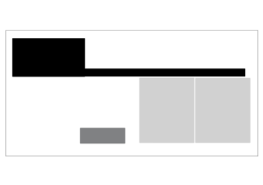
| fig.2.12. final layout after feedback blocked (28/10/24) |
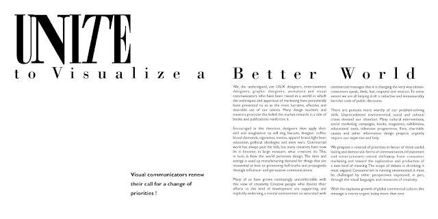
Final Task 2 - Typographic Exploration and Communication Formatting Details
Typeface: Bodoni Std
Font/s: Bodoni Std poster compressed, Bold italic, bold
Type Size/s: 280 pt
Leading: -
Paragraph spacing: -
HEAD LINE - To Visualize a Better World
Typeface: Bodoni Std
Font/s: Bodoni Std poster compressed, Bold italic, bold
Type Size/s: 280 pt
Subtext
typeface / fonts : Gill Sans Std Bold
type size : 14 pt
leading : 24 pt
BODY
Font/s: Gill Sans Regular
Typeface: Gill Sans
Type Size/s: 10 pt
Leading: 12 pt
Paragraph spacing: 11 pt
Characters per-line: 56
Alignment: 12,7 mm all sides
Columns: 2
Gutter: 4,233 mm
Specific feedback :
He says my second layout is pretty good, my Paragraph spacings is problematic because I clicked enter twice without noticing. I don’t need to put any other expression than unite and I could delete the type expression on the Visualize and world. the headline could be distanced because its in between the two page so I move it to the left with the words under it to so its not between the 2 page. When I printed it out he says that theres nothing else wrong with it so my work is done and I can proceed to put it in my E-portofolio.
General feedback :
Mr. Vinod gave us feedback on our second task. we need Pay attention to letter per lines and margins cause it could affect readability. He also asked us to print the task out in A3 paper so he could examine it.
Week 7
Specific feedback
during this week lecture, Mr. Vinod ask us to submit our final task 2 and finalize it. for my task 2 text format, mr. Vinod doesn't have any comment anymore so I continued on starting task 3
general feedback :
mr. Vinod highlights the submission for our e-portfolio and how simple things like access to file, not documenting progress well can affect our grades.
Experience
when doing this task, I realize that I need to pay more attention to what the lecturer says cause I missed the biggest point of the task where I supposed to use 200x200 size but I used A4 instead. I also experience doing text formatting as if Im making an article or a newspaper layout and I enjoyed it.
Observations
I saw other students work to compare it with mine and I see that mine are more simple compared to other. they got more creative in doing the headline and even went diagonally which I didn't try doing. they also mostly use the 1st and 2nd text choice that I tried to avoid because I believe that it will be more complicated but they execute it pretty well.
Findings
I found that doing text formatting especially for this task 2 isn't just copy paste text, arrange, then done. but I still need to adjust the them using kerning, decide on a fitting headline.

|
|
fig.5.2. letterform's contrast (27/10/24) |


Comments
Post a Comment