Digital Photography and Imaging - Week 12 - 13
09/12/2024- 24/12/2024 (Week 12-Week 13)
Cindy Noverin (0376409)
 Digital Photography and Imaging / Bachelor of Design in Creative Media /
Taylor's University
Digital Photography and Imaging / Bachelor of Design in Creative Media /
Taylor's University
TABLE OF CONTENTS
Lectures
Week 12
this week we don't have any lecture but we need to continue on
finishing our poster and continue on doing after effects for
week 13
Week 13
we had a consultation meeting and Mr. Fauzi gives advice on how to animate also giving a guide to remove green screen on after effects
Import your Final Poster to After Effects
Develop the composition techniques using Digital Photography & Graphic Design.
back to top
Video progress time lapse here 👇🏻
then, I import my psd file again into after effects and just replace couple things without changing the animation because I think the animation is okay and doesn't need to be overdone.
Practical
|
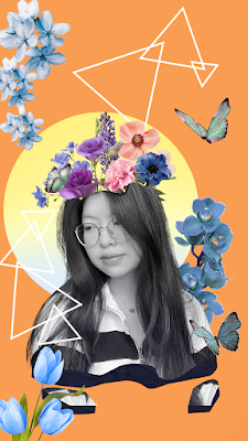
| fig.2.1. final before animating (09/12/24) |
after I finished doing my digital poster in photoshop and had the consultation meeting on week 13, I started working on the animation in after effects. I provided a time lapse video under below the video below this text. and I receive some feedback from my siblings and she said that the background and the circle could be changed and I changed it into the video below me at first
fig.2.2. first result (22/12/24)
fig.2.3. progress video(24/12/24)
then after animating the first one I scrolled through Pinterest to get more inspo, and to find a more fitting flower that could be a matching shade and colors, also finding a fitting background for the color palette.

|
|
fig.2.4. progress 4 (24/12/24) |
then, I import my psd file again into after effects and just replace couple things without changing the animation because I think the animation is okay and doesn't need to be overdone.
FINAL RESULT OF SELF-TITLED

|
| fig.2.5. final digital poster result (24/12/24) |
fig.2. final Video "Dreams in Full Bloom" (24/12/24)
Reflections
When making this final project, I struggle a lot in choosing a perfect background and how I want to combine the colors so that it looks good. also that, the difference of saturation of the first few flowers in my first attempt actually matters because after I changed it, it looks much better and even if my picture there ie black and white, after I changed the flowers, it doesn't look as bad as the first one.


Comments
Post a Comment