Advanced Typography - Task 3 : Type Expression and Application
22/04/2025 - 23/07/2025 (Week 9 - Week 14)
Advanced Typography - Task 3 : Type Expression and Application
Cindy Noverin / 0376409
Advanced Typography / Bachelor of Design in Creative Media / Taylors University
TABLE OF CONTENTS
LECTURES
all pre-recorded lecture summarized in Task 1 & Task 2
INSTRUCTIONS
My Proposal
fig.2.1. proposal slides, week 9
at the beginning of task 3 last semester, most of the students are told to
do uppercase letter, but somehow my font became a lowercase.
I kinda ignored the instruction to do the uppercase first then followed the
lowercase instead of doing the opposite.
Letter Constructions Week 9-10
I used my old files to reuse the guide and baselines. I copied the hogb so
I could know the position of the guides because I thought I could not move
or copy paste the guidelines when turns out its just locked.
lowercase letter progress 👇

|
| fig.2.2.2. lowercase progress, Week 9 |
the process of my uppercase letter, and I tried my bast to make it
consistent and use the same width and height for each letters I also have
decided the radius for each curves of the letter.

|
| fig.2.2.3. radius adjustment for most font , Week 9 |
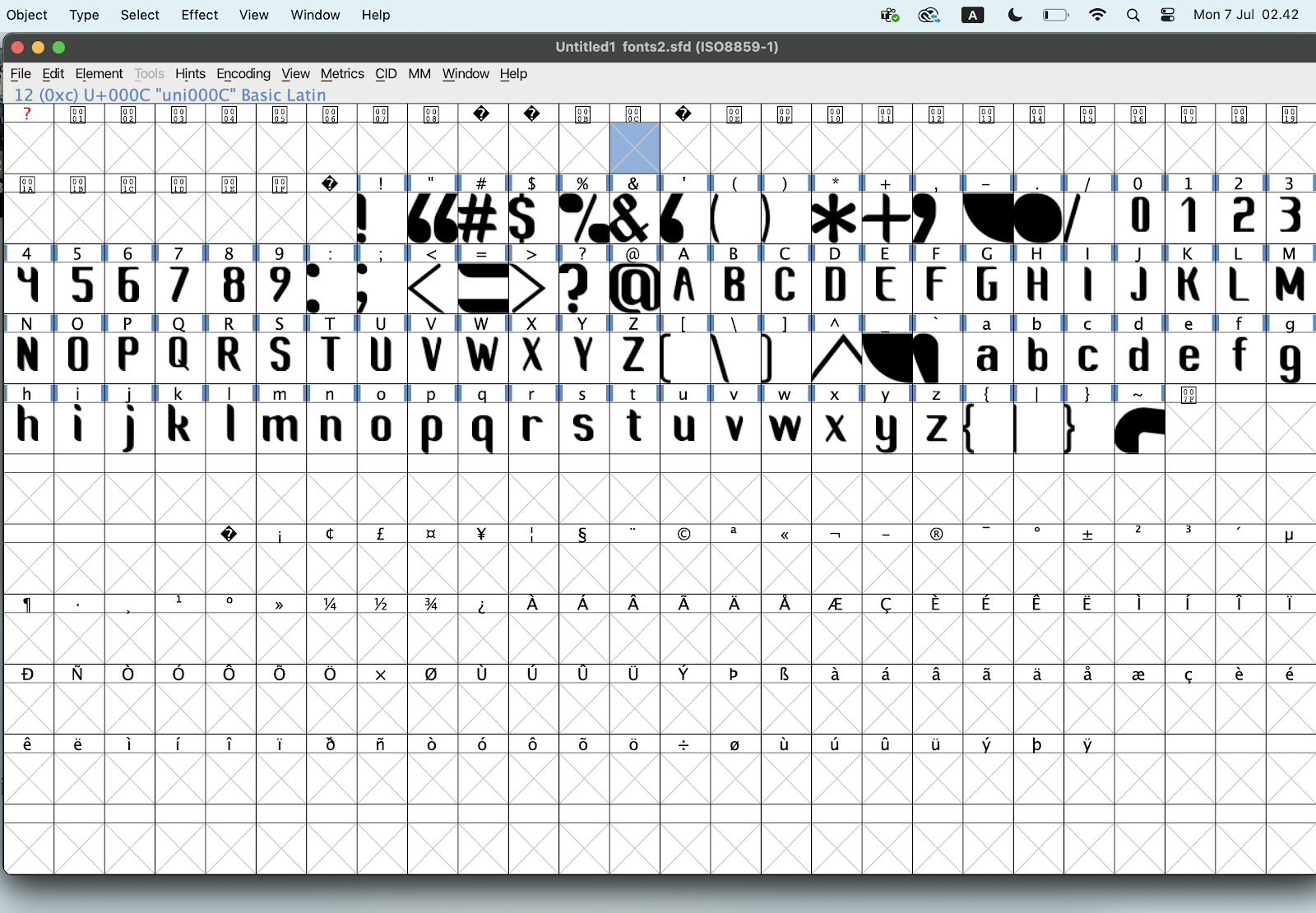
after the feedback session I continued, on doing my numbers and
punctuation, I tried to use the main font reference which is Myriad
Pro.
the punctuation that I struggle the most on are the Ampersand "&"

|
| fig.2.2.4. Progress of the rest of the letters, Week 9 |

|
| fig.2.2.5. changing the lowercase a to match the uppercase, Week 10 |

|
| fig.2.2.6. numbers progress 0-5, Week 10 |

|
| fig.2.2.7. numbers progress 5-9, Week 10 |

|
| fig.2.2.8. ampersand and at symbol, Week 10 |

|
| fig.2.2.9. whole letters facebook pos, Week 10 |
|
|
||||||||
I re-imported everything to fontlab 8 and the progress is
far more quick. there are just some small problem where it
shows red line under certain glyphs so I have to re-upload a
couple of times
then I quickly start on doing the side-bearings and kerning
for every word possible.
Font Presentation - week 12
I started them with making the font informations , then the
random words, the most unique out of all the letters, a
poster with quotes and the randomized alphabet with the
punctuations,
Final Font Presentation
|


|
| fig.2.4.2. font presentation 1 - JPEG, Week 12 |

|
| fig.2.4.3. font presentation 2 - JPEG, Week 12 |

|
| fig.2.4.4. font presentation 3 - JPEG, Week 12 |

|
| fig.2.4.5. font presentation 4 - JPEG, Week 12 |

|
| fig.2.4.6. font presentation 5 - JPEG, Week 12 |
pdf
fig.2.4.7. font presentations - PDF, Week 12
Font Application - Week12 -Week13

|
| fig.2.5.1. backgrounds for honor standby, Week 13 |

|
| fig.2.5.2. poster for applications mockup, Week 13 |

|
| fig.2.5.3. facebook submission, Week 13 |
Final Font Application

|
|
fig.2.5.4. font application 1 - Honor Standby (Overall Visual
Design), Week 13 |

|
|
fig.2.5.5. font application 2 - Honor Standby (Personalized Signature
Design), Week 13 |

|
| fig.2.5.6. font application 3 - Honor Standby (Clock Design), Week 13 |

|
| fig.2.5.7. font application 4 -poster mockup, Week 13 |

|
| fig.2.5.8. font application 5 - sticker mockup , Week 13 |
fig.2.5.9. font applications - PDF, Week 13
TASK 3 FINAL RESULT
fig.2.6.1. Font Information, Week 14 (20/07/25)
fig.2.6.2. Finalized Letteforms, Week 14 (20/07/25)
|
|
| fig.2.6.3. Font Persentation 1, Week 14 (20/07/25) |

|
| fig.2.6.4. Font Persentation 2, Week 14 (20/07/25) |

|
| fig.2.6.5. Font Persentation 3, Week 14 (20/07/25) |

|
| fig.2.6.6. Font Persentation 4, Week 14 (20/07/25) |

|
| fig.2.6.7. Font Persentation 5, Week 14 (20/07/25) |
|
|
| fig.2.6.8. font application 1 - Honor Standby (Overall Visual Design), Week 14 (20/07/25) |
|
|
| fig.2.6.9. font application 2 - Honor Standby (personalized signature design ), Week 14 (20/07/25) |
|
|
| fig.2.6.10. font application 2 - Honor Standby ( clock design ), Week 14 (20/07/25) |
|
|
| fig.2.6.11. font application 3 - Poster Mockup, Week 14 (20/07/25) |
|
|
| fig.2.6.12. font application 5 - sticker mockup, Week 14 (20/07/25) |
fig.2.6.13. Task 3-Final outcome, Week 14 (20/07/25)
FONT TESTER
FEEDBACK
Week 9 :
General Feedback :-
Specific Feedback : its good, I could continue with
expanding my font from last semester
Week 10:
General Feedback :-
Specific Feedback : when i make the lowercase i need to
put it beside of the uppercase letter.
Week 11 :
General Feedback :-
Specific Feedback : i could start on importing it to
fontlab or fontforge.
Week 12:
General Feedback :-
Specific Feedback : I could continue doing my font
presentation and Application
Week 13
General Feedback :-
Specific Feedback : I could start submitting the work to
HONOR Competition and finish my eport
REFLECTION
Experience
my experience during the making of this task 3 has been quite easy
and less trouble because I chose the font that I already made
myself so its just referencing and adjusting them to match each
other. Since I made the font that I wanted to expand myself, I'm
already familiar with the structure and implementing it in a new
letter is quite easy. The steps that troubles me the most is when
I'm making Ampersand, it took me a lot of attempts to actually
shape it how I want it to be and to make it look like an actual
ampersand logo.
Observations
During the process of developing the font, I observed that
punctuations like bracket have their own height and position that
I actually paid attention to before Mr. Vinod Point it out during
the week 12 class. Moreover, when making these punctuations and
number I actually have to make calculations like how my original
width is 135 and then I eithe rhave to divide it by 3 or two to
get an accurate viwe of the punctuations, for example the ">"
and "<"
Findings
I found that when developing the font especially exporting it from
illustrator to font forge would took a lot more patience. I
thought font forge would work like how font lab do but its far
more complicated especially when it comes to resizing the path or
shapes. I also found that when exploring on how I want to present
my font, that my font would fit a doodle type of contents
FURTHER READING

its one of the pdf files provided by Mr. Vinod to study on so we
can take it as reference or inspiration, I use this page
specifically to help me design font presentation 3


Comments
Post a Comment